
Omen: Predictive Insurance
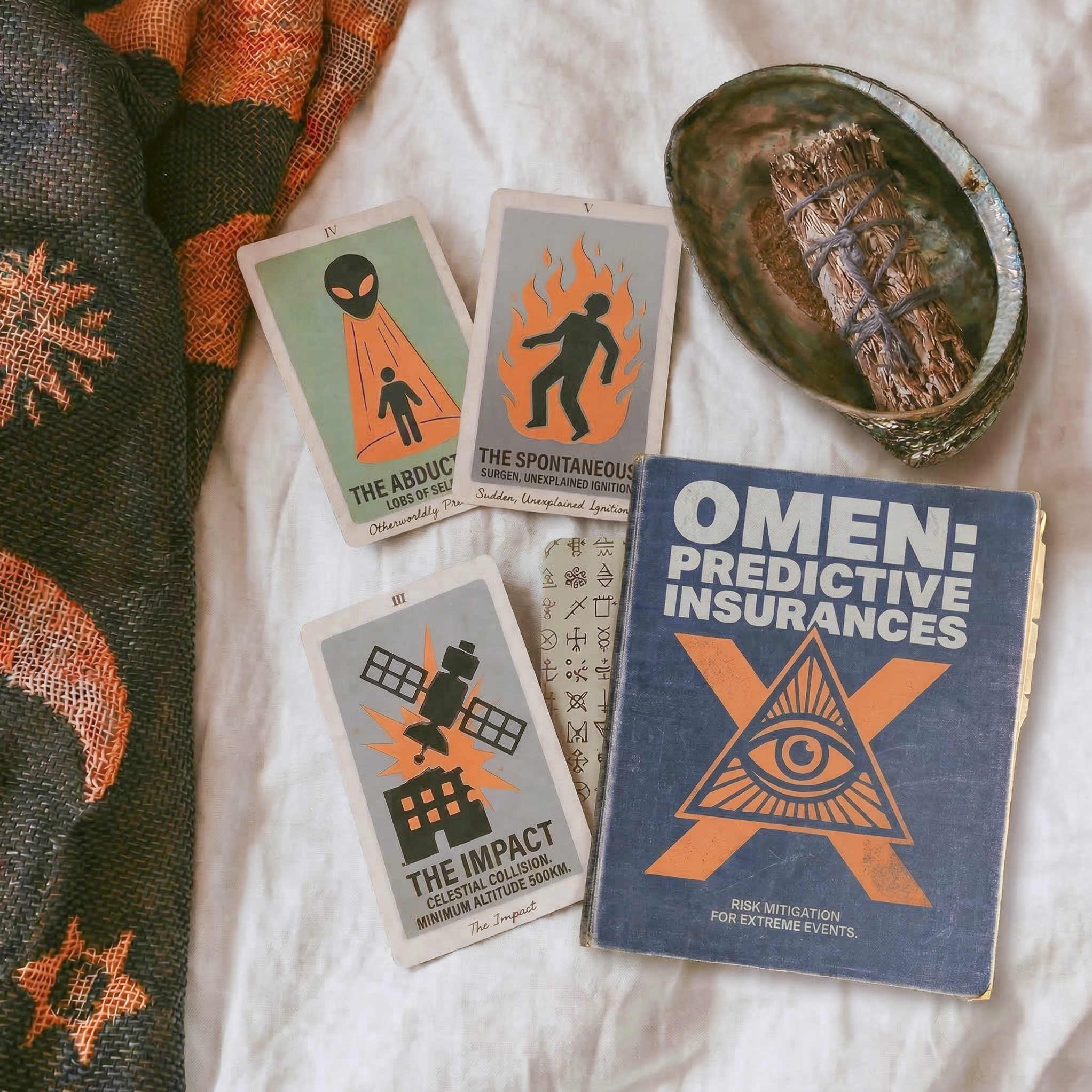
Traditional insurance companies cover the mundane—fender benders, flooded basements, stolen laptops. But who covers the truly unpredictable? Omen Predictive Insurances is a boutique risk mitigation firm for the esoteric, the apocalyptic, and the highly improbable.
I replaced the traditional, boring policy brochure with a deck of diagnostic tarot cards, allowing Omen’s "agents" to divine a client's specific existential risks—ranging from alien abduction to spontaneous human combustion and even celestial collisions. The visual identity merges corporate manuals with occult symbolism, creating a brand that is equal parts institutional and supernatural.
The bold, rigid sans-serif fonts ground the absurdity of the graphics in a funny, deadpan reality while the muted blues, faded creams, and safety oranges invoke the retro vibe of the 1970s.
The Museum of Failure
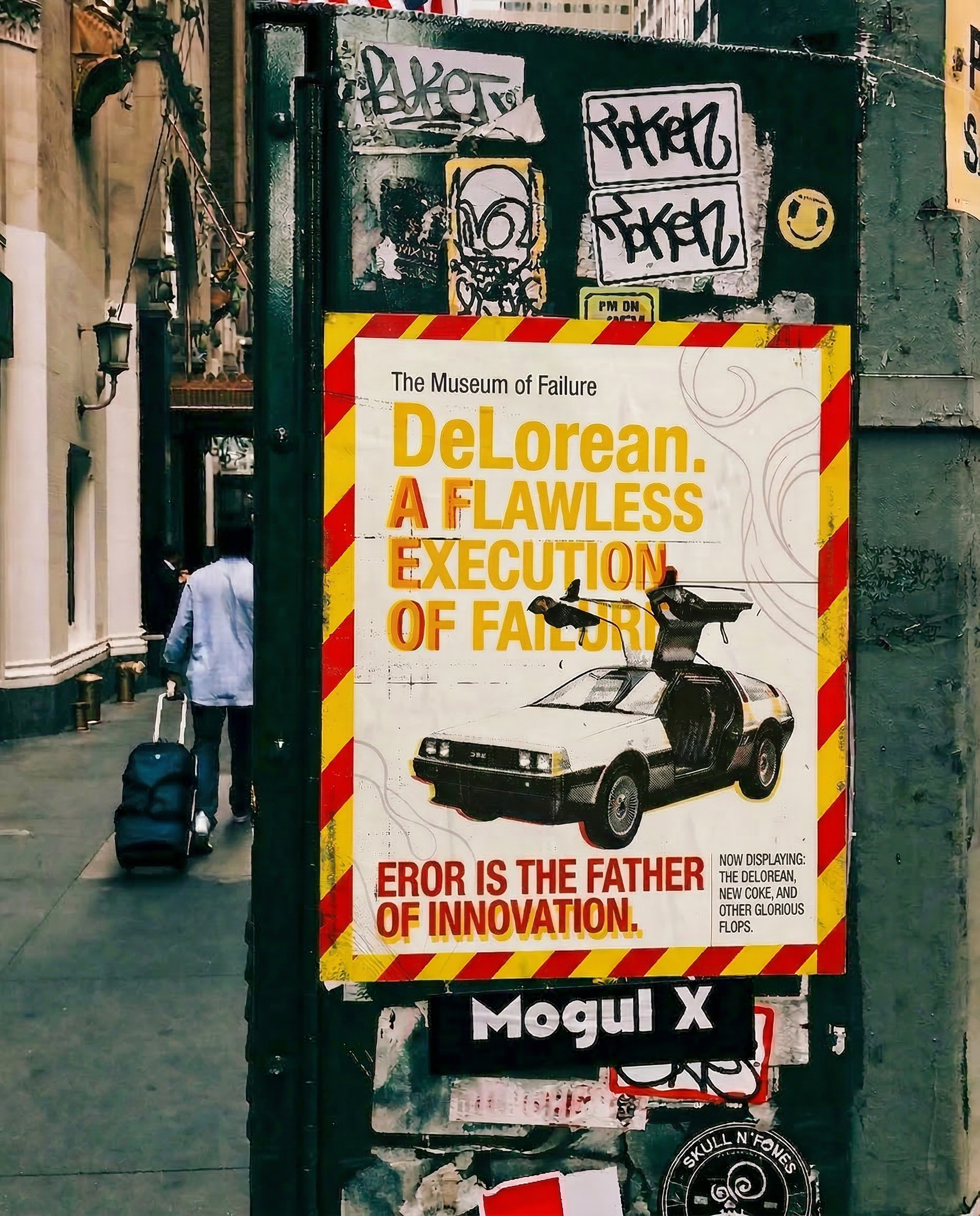
Society treats failure as a dead end, but innovation requires spectacular flops. The Museum of Failure is dedicated to celebrating the world’s most iconic missteps—like the DeLorean and New Coke—proving that progress is built on a foundation of questionable ideas.
I designed a guerilla out-of-home poster campaign that embraces the beauty of the mistake. Using hazard-tape borders, bold industrial typography, and an intentionally flawed manifesto ("EROR IS THE FATHER OF INNOVATION"), the brand voice leans completely into self-aware irony.
The stickers, graffiti, and urban grit in the mock-up contrast with the traditional "museum" concept, making it feel like an underground, disruptive exhibition rather than a stuffy gallery.
BLOOM
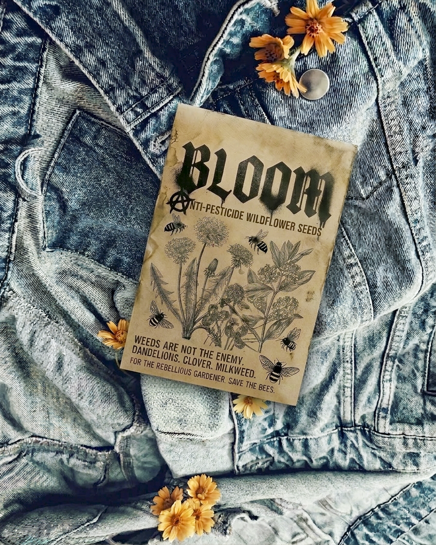
Traditional gardening brands sell a sanitized, manicured ideal where "weeds" are the enemy. BLOOM targets the anarchist gardener. By reframing dandelions, clover, and milkweed as vital ecosystem sustainers, the brand turns planting seeds into an act of environmental defiance.
I disrupted the standard, gentle aesthetic of seed packaging by pulling directly from punk and hardcore visual language. Using gothic typography, anarchy symbols, and distressed textures, the packaging positions the act of “saving the bees” not as a gentle hobby, but as a rebellious counter-horticulture movement.
Repose
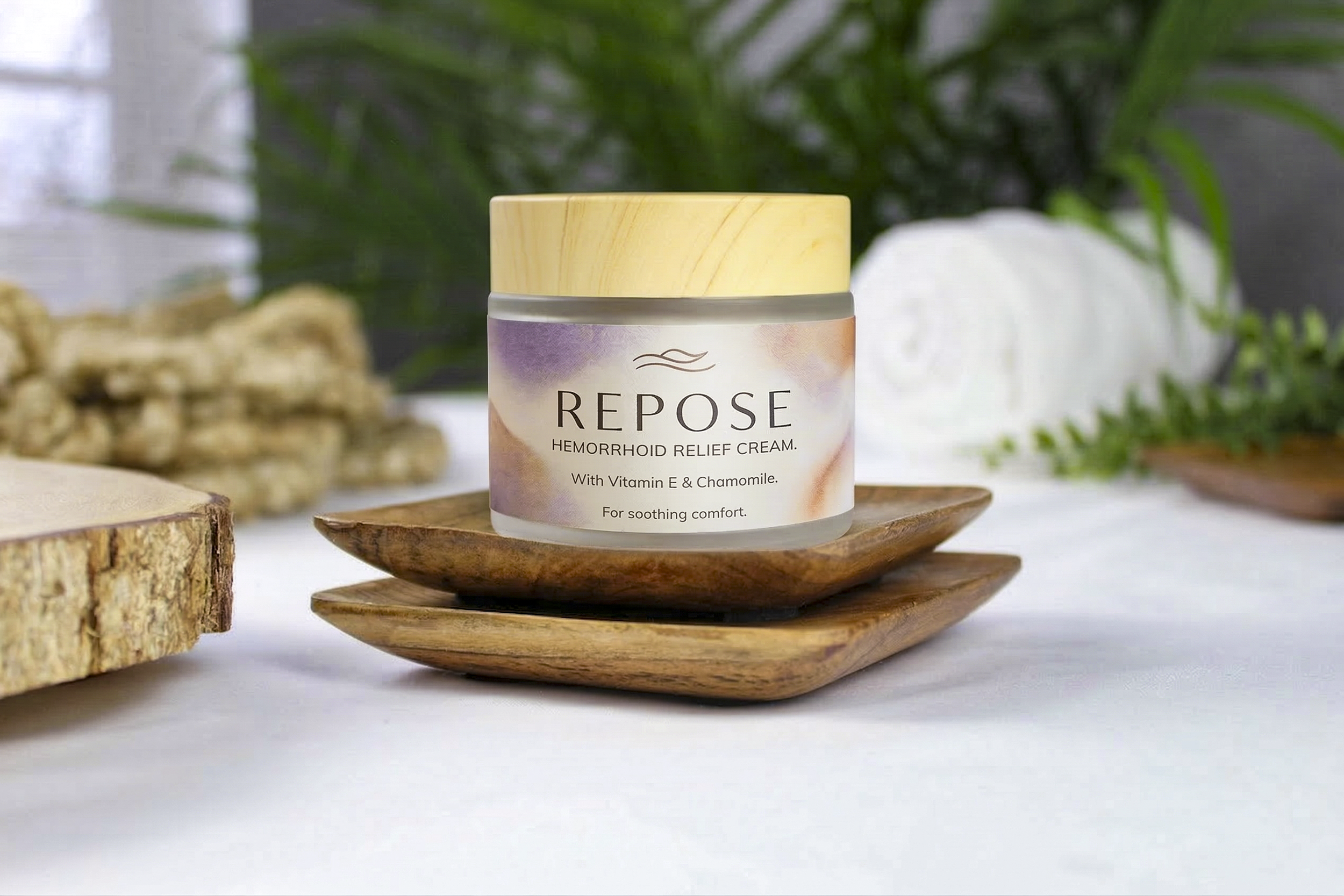
Why do the products we need the most have to look the most clinical and embarrassing? Repose elevates the unglamorous aisle of the pharmacy by treating "ugly" hygiene with the reverence of prestige skincare. It proves that necessary medical relief doesn't have to announce itself with garish pharmaceutical branding.
I took hemorrhoid cream, a universally dreaded pharmacy purchase, and completely reimagined it for the luxury wellness market. By utilizing the visual language of high-end spa products—frosted glass, bamboo lids, soft watercolor textures, and elegant serif typography—Repose creates a surprising, humorous, and highly aesthetic tension between the product's function and its form.
Staging this on a wooden soap dish with rolled white towels and ferns in the background provides the perfect spa ambience. It looks exactly like an editorial shot for a luxury facial treatment, which makes the word "Hemorrhoid" hit so much harder when the viewer actually reads it.
The elegant, tracked-out serif font for "REPOSE" paired with the delicate wave icon sells the illusion of an artisanal, holistic wellness brand.
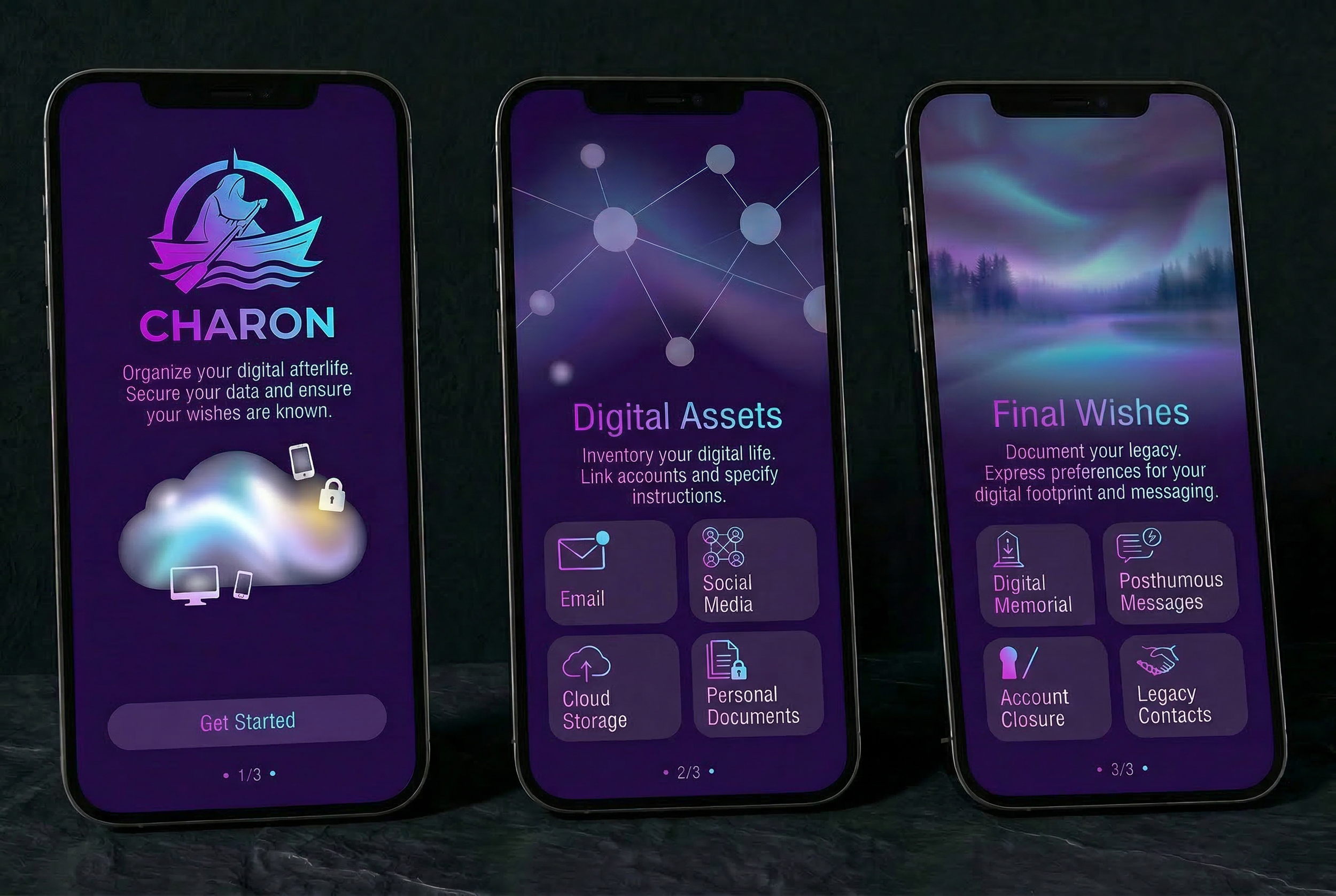
Charon
When we die, our physical bodies are laid to rest, but our digital footprint lives on. Charon is the modern ferryman for the digital afterlife. It’s a comprehensive "death app" designed to inventory, encrypt, and execute your final online wishes— whether that means preserving cherished memories, setting up posthumous messages, or permanently scrubbing your browser history.
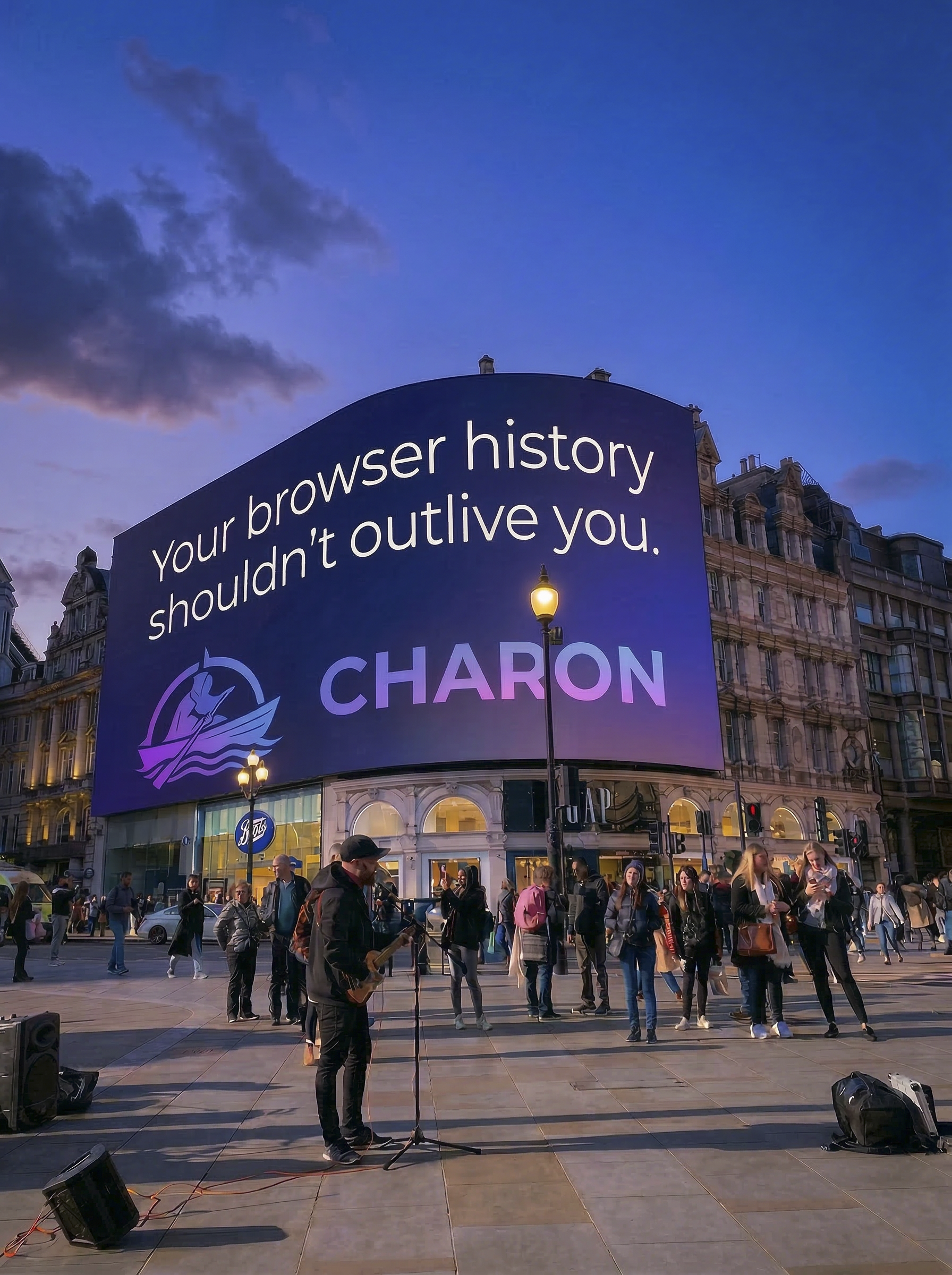
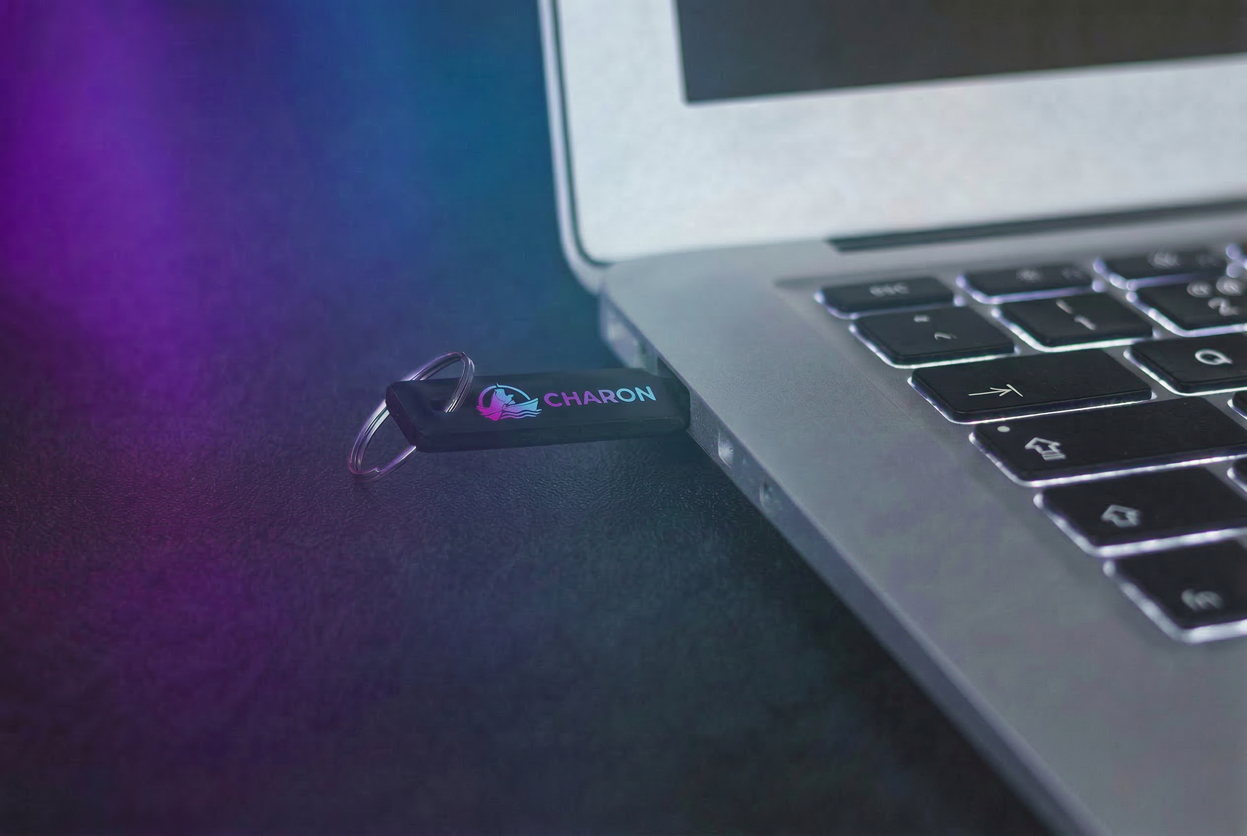
The visual identity bridges the gap between ancient mythology and modern cybersecurity. Using ethereal gradients to evoke a sense of the "beyond," the design is balanced by clean, trustworthy UI. The campaign spans an intuitive mobile app, a physical "kill switch" USB key, and high-impact social advertising that uses blunt, relatable humor to address a traditionally taboo topic.
"Your browser history shouldn't outlive you" immediately identifies a universal anxiety and makes people laugh at a subject they would normally avoid.
The USB key gives users a tangible, physical artifact to control an intangible, digital afterlife and grounds the whole concept in reality.